
CURRICULUM: 3


 STEP 3 – Data Sketches: Making Data Visual
Hands-on Exercise
Using a creative thinking process, students create their own representations of geospatial datasets on tracing paper, then overlay those different “data layers” to discuss patterns and correlations.
Instructions (downloadable pdf)
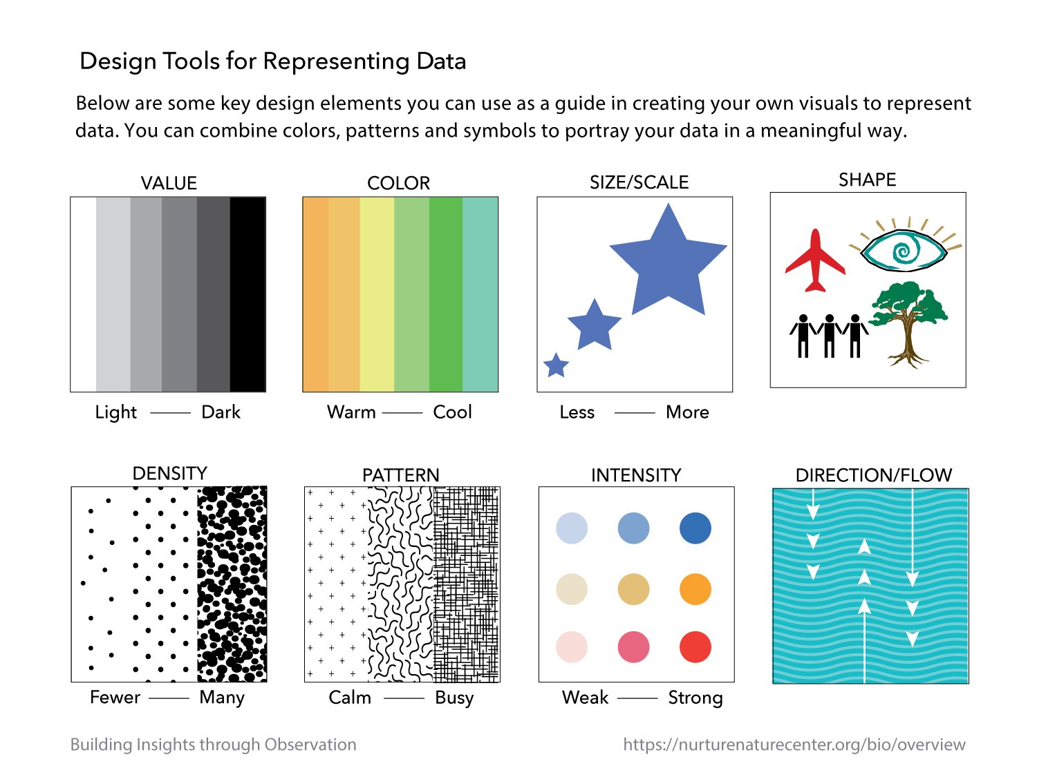
Design Tools Guide
Base Map Template
Student Worksheets
Click here for a video about Part 3: Data Sketches
Learn how to find easily accessible mapped data visualizations for VTS and Data Sketches by watching this Dataset Hunting video. (23:18)
 Instructions
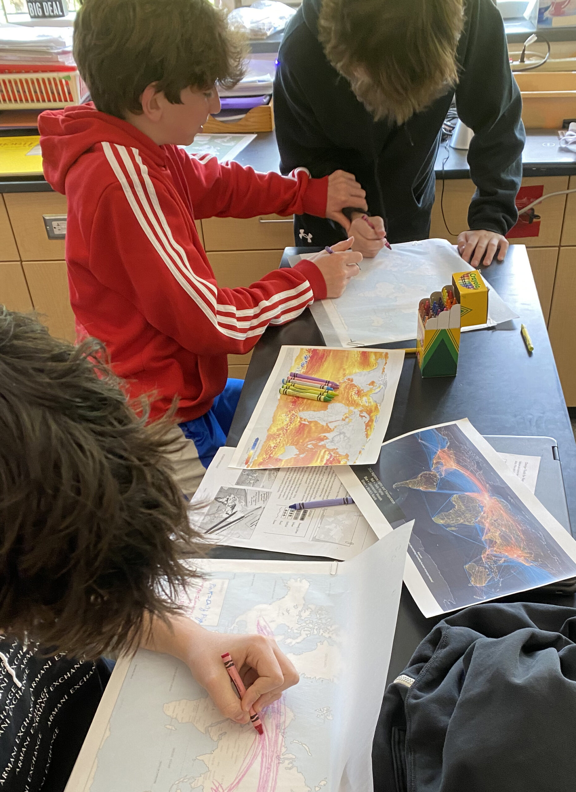
This exercise borrows from the Design Thinking Process in a way that gets students engaged in group collaboration, hands-on creation, and critical thinking. Students work independently and collaboratively (3 at a table) during this process. Students practice spatially processing maps that aren’t the same scale and may contain distortions, using design tools to represent a set of data across a map; and layering maps to discover what inferences can be made.
Through the active process of sketching, students grapple with what they’re learning and reconstruct it in a way that makes sense to them. While the drawing of the map is a key component, it is equally crucial students collaborate within their group and have teacher-guided discussion to help support them through what may be a new learning experience. This activity is broken into two components which can be spread between two classes. Alternatively, the mapping and worksheets can be assigned as homework.
This activity is hands-on and requires printing of a larger format (11 x 17) map and a semi- transparent paper like tracing paper that is also at least 11 x 17. Your local print shop or office store can print out this larger size and tablets of tracing paper can be ordered online. We found that a 14 x 17 pad of tracing paper is ideal. The printed map is to serve as a template and can be used over again and again.
Part 1 : Collaborate and Design
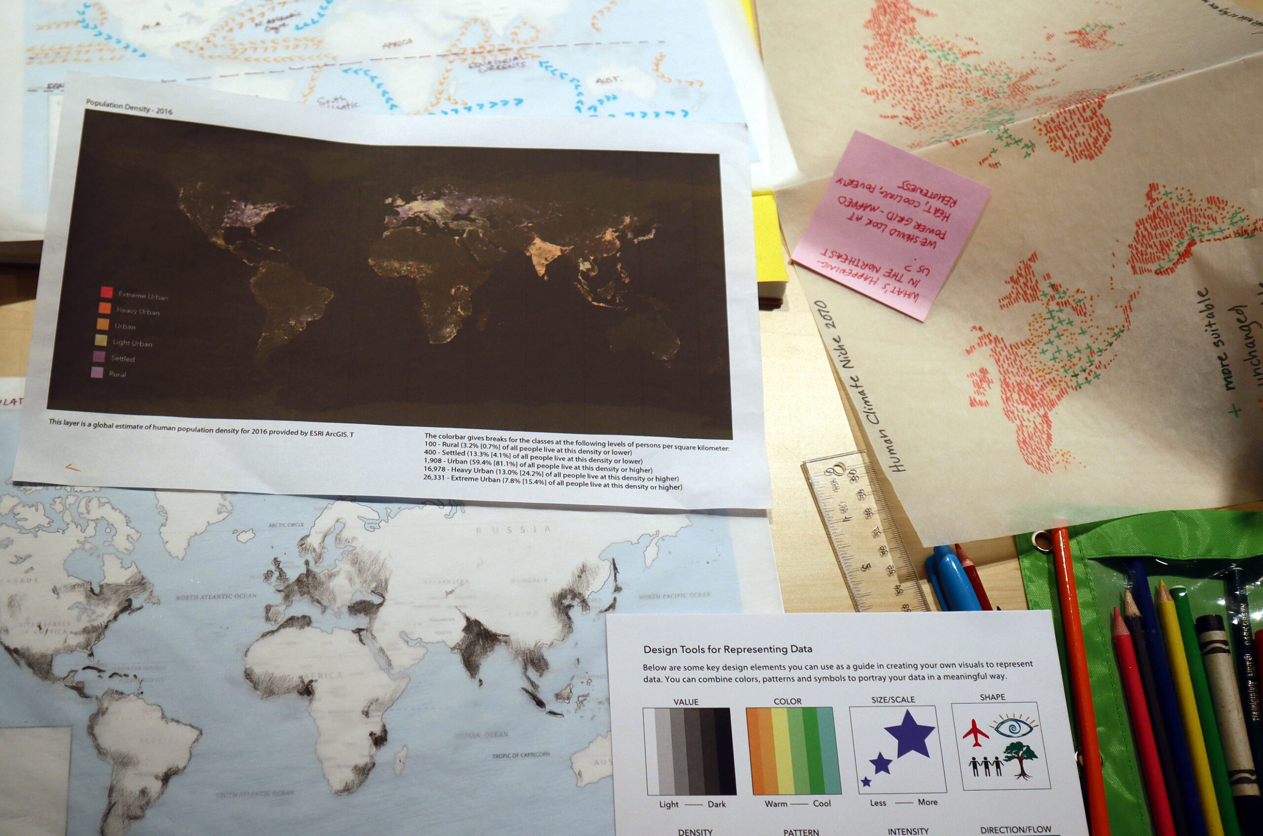
- Break the students into groups of 3 (if possible). Give each student a printed copy of the original mapped data (with legend) from Step 1: Observation and Discussion along with the Design Tools Guide.
Note: By now the students should be familiar with both the original map and the design tools. - Explain: “Remember how we looked at the different mapped data representations and how we used the Design Tools to come up with our own symbols to answer the questions in the Fencepost Activity? Today we are going to discuss mapped data further and practice using these tools ourselves by creating our very own map legends with symbols, colors, marks…”
- First, let’s remind ourselves about our map from earlier in this lesson.
Invite discussion about the following questions regarding the printed map you have handed out (10 minutes):
What design tools were used to draw the data on this map?
What is included in the legend?
Why do you think they chose this particular design tool for this set of data?
While some tools are better for representing sets of data, there is no right or wrong tool. Are there different design tools we could use to represent this data? Look through the Design Tools Guide card and discuss what some good choices might be for this topic.

Give each group two additional mapped datasets related to the topic so that each table of three students has a total of three maps to work with. Include the source of the data on each map. For guidance on selecting maps for this exercise, visit the Dataset Resources Guide.
A note about map selection for Data Sketches:
– Select datasets that relate to your topic and tell a story when combined or layered together
– Begin with data that can be simply drawn or simplified in some way
– Exclude datasets with confusing legends
– Try to include a ‘human element’ in at least one of your datasets (for example SOS’s: population density, nighttime lights, human climate niche or shipping routes)
– Tailor the data and maps to the skill level of your students – lean towards more simple maps and less complex data for students who may need more support.
- Invite students to silently observe their maps for a few minutes.
- Ask the students to decide within their group how they might represent
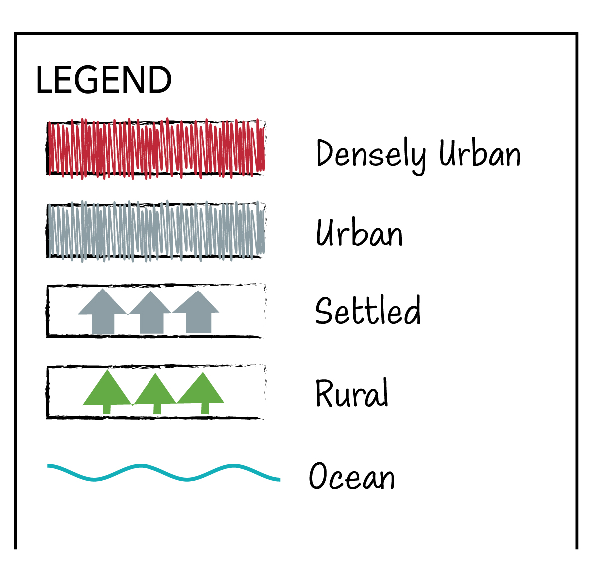 the data in each of the three maps in a different way than it is currently while using three different design tools (ie. color, symbols, scale) from their Design Tools Guide for the three maps. Have students work on developing new legends for each map using scrap paper, pencils, and markers (10 minutes)
 - Ask each student to choose one of the maps. Hand out the Data Sketches Student Worksheet 1 and the Base Map Template.
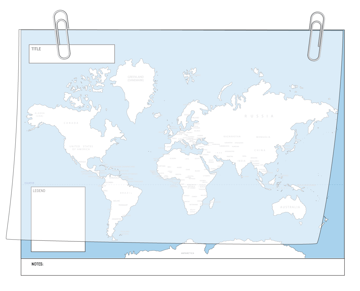 Have students paperclip a sheet of tracing paper over the map template and follow the prompts on Worksheet 1 (please show an example of what they are being asked to do). This worksheet will guide them through beginning their map. You, as the teacher, can walk through each step one at a time, if needed, or have the students follow the instructions independently. Note: The map template requires each student to create a map that is on the same scale as the others so that these maps can be easily layered together in the second part of this exercise.
- “Sketch” – the final task of this worksheet asks for the student to use their new legend as a guide while sketching out their mapped data with the new design tool they chose in their group. Students may begin by tracing the outline of the countries and, although it is not necessary and sometimes time- consuming, it is a way that they can begin to process the map spatially. For that reason, the timing of this component is variable and left up to the teacher. Students should have a minimum of 20 minutes to respond or the teacher may choose to break here and allow the students to complete their mapped “work of art” at home overnight and wrap up the next day with Part 2.
Part 2 : Analyze and Discuss
- Looking at the maps they have sketched, ask students to write a one or two sentence summary of what their sketched data represents and then answer the three following prompts (Worksheet 2).
My sketch represents…
I see…
I wonder…
This data is interesting because…
Have the students share their answers with their group.
- The groups then work together to layer two maps at a time and look carefully at the paired maps, noting any patterns and correlations they can find, hypothesizing about what the correlations mean, and giving each other feedback.
- Students report out as a group to the rest of the class, answering the following prompts: Why did you choose that design tool? Was there anything interesting you discovered when you mapped the data? What correlations were you able to find when you layered your maps? What do these maps tell us about ______ (topic)? Remember that in this exercise, the teacher can guide the discussion, correct the course, and introduce information about the topic as the lesson unfolds.